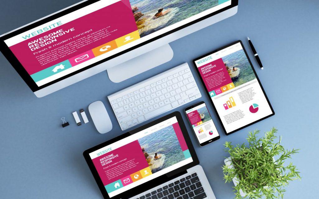
Till very recent times, creating a mobile web design that is made to work and look much the way a native application does was the unachievable goal for mobile web designing companies. There are quite a few different templates which try to emulate the feel of the native app but there is still a large difference between web applications and the mobile’s native apps.
The new generation of smart phones though, have allowed web designers to feel free to use more detailed and responsive web sites which feel as though they were made simply for that device. Here are a few advanced pointers shared on TweakYourBiz, which can be used to make better quality web sites for mobile devices.
- New Types of Calendars
Using a calendar on a mobile device has never been a very convenient experience. Most web designers try to steer clear of calendars and prefer using simplified lists of dates instead.
By using JavaScript and exploiting carousels, calendars can be made very easy to use on mobile devices.
- Off-Canvas Flyout Content
Off-canvas flyouts are those areas of a web page which are not viewable until an action such as a tap or a swipe is performed. Mobile devices now use off canvas flyouts as their basic navigation system for both native and web-based apps and these have started becoming popular with desktop computers as well.
Generally, off-canvas flyouts are used to lower menus and static content but creatively using these flyouts can really add some extra flavour to your aesthetics as well as create some more dynamic functionality.
Both static and dynamic content can be put off-canvas. Navigation flyouts can be hidden on the right-hand side and you can have a secondary flyout on another side with other details such as history or preferences.
- Actions (Pinch to Zoom)
For text, having to pinch to zoom is a sign of content and text which has not been properly formatted. However, it is a different case with images. Native applications and maps allow such zooming in but users like doing the same on images on the web. Generally, the entire web page zooms in or out making the experience a little cumbersome.
It is important to note that performance should be taken into consideration and high-end complex designs should be made for devices which can handle the amount of processing power it takes to run such features. Web designing companies generally make device specific websites but it can become a costly affair to customize the mobile web page for every device.
The hammer.js library is a good place to look for how to add the pinch to zoom functionality to viewport constrained images.
- Image Carousels and Performance
Devices are not generally powerful enough to run such carousels. There needs to be a certain amount of processing power which is required in order to render many images in a row.
Generally, an image is as big as the screen. Now carousels put a hundred similarly sized images next to each other in a row. It will be quite wide.
The big image carousels are more than 80,000 pixels wide. Mobile browsers generally crash or fail when they attempt to render such elements despite there being plenty of empty placeholders without any media content.
You can simplify and optimize the carousel so that inactive slides do not eat space. You can use DOM rewriting properties in order to show images on requests only and this reduce the amount of CPU energy required to render carousels. The size of the page can drop from around 6 MB to 650 kB.
Stay informed, Stay ahead and stay inspired with Get News 360
